COLLEGE LOGO
Significance and History
Every Stella Marian is familiar with the logo of the College - a ship sailing on stormy waters, guided by a star, Stella Maris, a Latin term which means 'Star of the Sea', which is one of the titles of Mary, the Mother of Jesus. The ship stands for our lives, the stormy waters represent the difficulties we face. The star which guides us in the storm and shows us the way is Mary, the Star of the Sea, who is symbolised by the capital M surmounted by a crown.
The logo which underwent minor changes over the years, took its present final form only in 2008 and was designed by Dr. Margaret Thomas, the current head of the Department of Fine Arts.
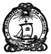
The first version of the College logo and motto, designed by Mother Klemens, and used in 1947, already has the familiar symbolic images: the star, the ship and the capital M. However, the logo of this first version uses Latin rather than English, and is slightly different from the present one. The original motto - 'Ad CaritatemPerVeritatem' not only highlights the importance of Truth and Charity, but also shows that they are closely intertwined. The outer edge of the circular framework is enclosed by a rope with ornamental loops and bows.

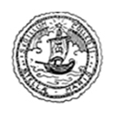
In 1948, the College Logo was redesigned by Mother Lillian and Mother Edith. In this second version, the original Latin Motto is replaced by two Latin phrases: SigillumCollegii and Stellae Maris. The framework is now encircled by a smooth rope with no loops or bows enclosed within a wavy circle.

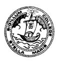
In 1982, changes appear. The inscription is no longer entirely in Latin. It now reads Sigillum College and Stella Maris, and the wavy outer circle has disappeared.

In 1997, changes appear again. The Latin inscription and the wavy outer circle reappear.

In 2007, colours are used for the first time. Blue and Gold, the colours of the Stella Maris flag, bring the logo to life. Blue symbolizes truth, loyalty and fidelity and Gold symbolizes love, zeal and charity. But there is no wavy circle.

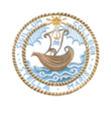
The final version of the College Logo appears in 2008. The wavy outer circle - now in blue - reappears, and the two key words of the College Motto (which are underlined) appear on either side of the Logo. The Logo itself is placed above the name of the College.

